Nine Points
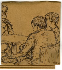
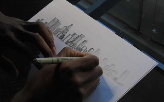
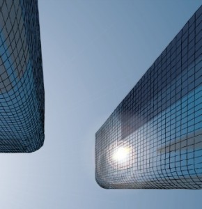
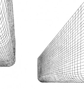
Although the planning of a panel on a page is entirely freehand pencil or pen work, it is indeed the case that sooner or later I start detailed placing of subjects, and I often use perspective to do the layouts. Not just for skyscrapers and so forth, but for down to earth things too. I do it the old-fashioned way, which is repetitive and time-consuming, but I must admit – It is fun! Take some time to look at everything around you – real or represented in drawings, photos, etc – and you’ll likely see perspective cues that help give sense of depth and placing. It is all about geometry, which our universe seems to like a lot, and which we use to navigate in it. Learning a bit of this geometry, and how to build it in projection in two dimensions on the page (and it is much easier than this sentence makes it sound!) allows one to make reasonably convincing recreations of the universe (or simulacra of your choosing) and how we perceive it. Real artists (not hacks like yours truly) use geometry a lot, in one way or another, to interpret, represent, or distill aspects of the world, and so in a sense, they are companions on the same road as those of us in (especially) the physical sciences.
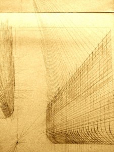
Babble aside, here you can see parts of the interior of a cafe taking shape. I did it using three-point perspective*:
This will be the skeleton upon which I build the flesh of the rest of the piece. It is based on my knowledge of a real cafe that I location-scouted (well, I happen to drink coffee there from time to time), but you’d never get this view without (a) perhaps being able to fly, and (b) removing the ceiling. Trying to be somewhat discreet in this […] Click to continue reading this post


