![]() So, here’s yet another project I’ve been working on. I forgot to tell you about it. After the success of the short films I produced and directed (etc) two Summers ago (remember? Shine a Light and Laser), the next step was to get more people involved in the film-making, to learn more about how it is done, and what is involved, both on the science side and the film-making side. Specifically, I want students from both sides of the divide (science, and film, journalism, communications, etc) to have to work with each other to learn more about communicating science.
So, here’s yet another project I’ve been working on. I forgot to tell you about it. After the success of the short films I produced and directed (etc) two Summers ago (remember? Shine a Light and Laser), the next step was to get more people involved in the film-making, to learn more about how it is done, and what is involved, both on the science side and the film-making side. Specifically, I want students from both sides of the divide (science, and film, journalism, communications, etc) to have to work with each other to learn more about communicating science.
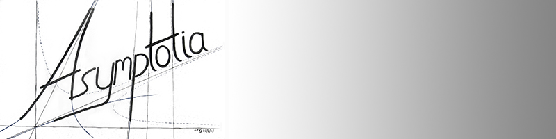
So, Anna Krylov (Chemistry dept., and a collaborator on an NSF grant) and I wrote a grant application to a foundation for prize money and so forth, to support a short science film competition for USC students! We got the money (hurrah!), and so it is going ahead. I’ll tell you more about it later, but right now I’m designing the poster and so forth to start the advertising for it. While returning from Aspen, on the road I grabbed a pen, squinted a bit and furrowed my brow, and lo! – the idea for the logo popped onto my notebook page. Upon returning, I drew it and painted it, and there it is on the left. You can click on it for a larger view.
Now, it looks simple, and it is, but still, there are some built in visual elements in there that I find myself wondering whether anyone will notice. It includes a satisfying (sort of) visual pun…
Feel free to point some out if you see them! (The rough drawing has some of the design elements laid bare, so I’ll update this post later with a copy of it after you’ve had a chance to guess.)
-cvj


Pingback: Crazy Week… at Asymptotia
Hi Jennifer…. Thanks! Yes, you seem to have seen most of them. The one other thing is that the pressure apparatus used to be called a U-tube, and I kind of like the idea that there’s a U-tube in the poster graphic for a short film competition, where of course those short films will end up on…YouTube.
Anyway… there you have it.
Cheers!
-cvj
Rats, my comment was lost. I only was able to see the color scheme as a lovely visual pun – the colors of the visible light spectrum, advancing from shortest wavelengths (violet) to longest (red), which I like.
The other puns are harder for me – I saw magnets as the “m” and thought I could get the other objects to speak to their letters. But test tube is not an “i” and the pressure apparatus – well there is liquid in it, and that’s an “l” so could be – but that test tube holder, cannot find an way to link it to “f.” Anyway, very nice….
Certainly the colors advance as the spectrum of visible light – starting at short wavelengths and ending on the longest – I like this.
I wish I could tell what else is going on – I see that the “m” is made of magnets, and I was thinking that the other objects also belonged to their letters. But I don’t know what the other objects are called. One looks like a test tube, but it’s an “i” so that doesn’t fit. The clamp/holder apparatus also doesn’t have a name that starts with an “f,” at least not one that I know. And the pressure apparatus, with the liquid in it…well, maybe the liquid is the “L”?