
What small things? Elementary particles! The second of David Kestenbaum’s excellent report on CERN’s LHC aired yesterday on NPR’s All Things Considered. You can see what I said about the first part here, and the second part can be listened to on the NPR website here. There’s also more video, extra audio, and a transcript.
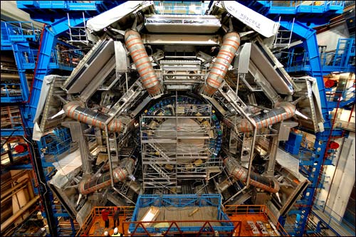
(Image: The seven story tall Atlas detector at the LHC. (photo: Serge Bellegarde))
The focus on this one broadens out to marvel at the sheer scale of the experiment as a civil engineering feat, and also as a feat of human cooperation (consider the many countries, languages, different people, etc, who are collaborating to make this happen). It’s great to hear the many voices of the various scientists he talks to.
(It’s also great, on a personal note, to hear Jim Virdee (the CMS spokesperson) Click to continue reading this post


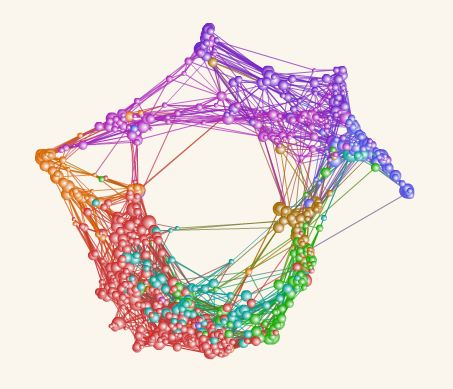
 The work, by Richard Klavans and Kevin Boyack, shows aspects of the connectivity of relations between scientific disciplines (colour key to the left), based on analysis of about 1.6 million scientific articles. Rather pretty isn’t it? And, yes, of course, very interesting to see the connectivity visualized like that.
 While listening this morning to President Bush splutter and stumble his way through a bunch of mostly softball questions from the press at the Whitehouse (as usual), I was put in mind of this
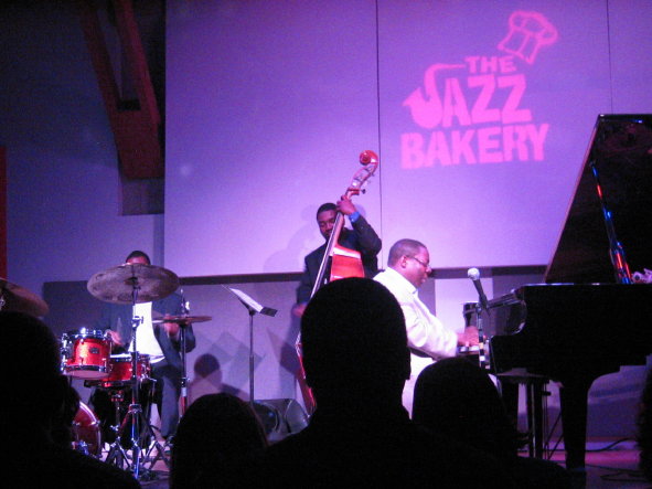
 Saturday night, after a quick trip to catch the end of a pleasant reception down at the
  The city’s Center for Reduction of Noise Pollution issued a public call to action last month, citing an increased number of confrontations spawned by a new phenomenon: It’s called “ring rage,” and it involves strangers getting into fights over obnoxious cell phone ringtones.
