Physics Intervened…
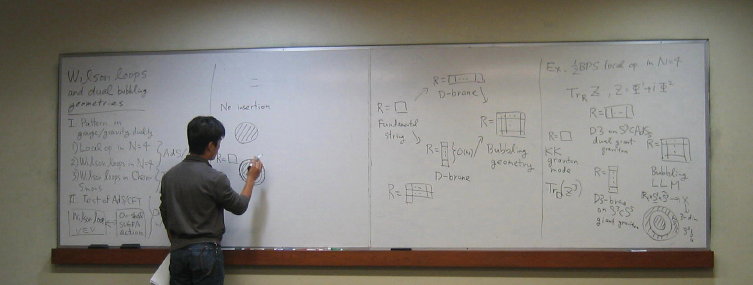
Well, I’d have hoped to have done a post today on a few things, but physics intervened. Recall that the Southern California Strings Seminar is on right now here at USC, and since I am the organizer, I’ve been nipping about serving up piles of various types of tasty cookies (hunted down on a late night visit to Trader Joe’s last night – gotta have good cookies to go with the coffee you see), announcing the speakers, and so forth, as well as actually sitting and enjoying the really excellent talks that we’ve had from several young people. Day one (finished off with dinner, wine, beer, and chats with people from USC, UCLA, and UCSB at Bacaro) was just great and day two is in the morning and so I’d better finish up this post and get to sleep.
We had a spectacular sunset on Saturday. Another example of a physics intervention, […] Click to continue reading this post



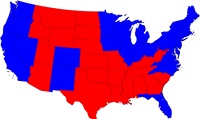 There was a lovely segment on NPR the other day about cartograms – representations or maps of regions that are weighted or highlighted according to the sort of data you’re interested in studying. It was an interview with Mark Newman (Univ. of Michigan) about the book “The Atlas of the Real World: Mapping the Way We Live” (by Daniel Dorling, Mark Newman and Anna Barford).
 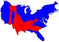 To the right is an example of the sorts of things they do in the book, showing the re-adjusting the map of the USA to have the size of a state correspond to its electoral college weight (below) instead of its geographical weight (above).