
Finding Your Way
Here’s a map of science*!
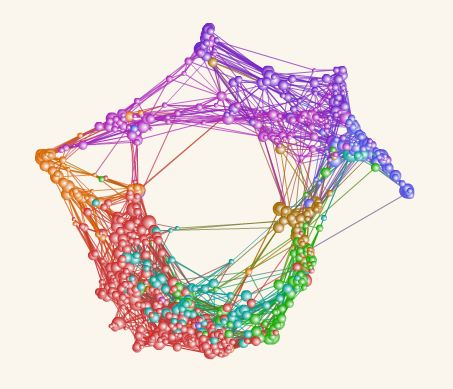
 The work, by Richard Klavans and Kevin Boyack, shows aspects of the connectivity of relations between scientific disciplines (colour key to the left), based on analysis of about 1.6 million scientific articles. Rather pretty isn’t it? And, yes, of course, very interesting to see the connectivity visualized like that.
Please visit their website to see how to visually slice all of this to highlight areas of the map by (a limited selection of) countries, regions, institutions, blue vs red state (!), etc.
There’s more information about the relationships in this Seed article, where there’s a […] Click to continue reading this post
 While listening this morning to President Bush splutter and stumble his way through a bunch of mostly softball questions from the press at the Whitehouse (as usual), I was put in mind of this recent excellent Onion article, entitled “Heroic Secret Service Agent Takes Question Intended For Bush”.