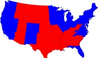
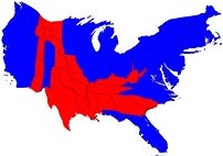
 There was a lovely segment on NPR the other day about cartograms – representations or maps of regions that are weighted or highlighted according to the sort of data you’re interested in studying. It was an interview with Mark Newman (Univ. of Michigan) about the book “The Atlas of the Real World: Mapping the Way We Live” (by Daniel Dorling, Mark Newman and Anna Barford).
 To the right is an example of the sorts of things they do in the book, showing the re-adjusting the map of the USA to have the size of a state correspond to its electoral college weight (below) instead of its geographical weight (above).
There are examples of the maps they have presented on the NPR site, and of course the audio of the interview (and a short version of it in transcript). Find it all here.
It’s rather good.
-cvj


And here’s a map of Europe:
http://uncyclopedia.wikia.com/wiki/Image:Europe_middle_earth.JPG
Enjoy.