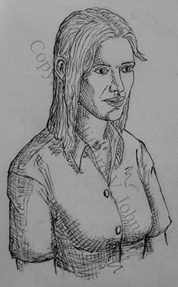
 Part of the process of redoing some of the work I did in the prototype story for The Project. This is an inked treatment of one of a trio of panels in the story entitled “The Arena”. (Warning: Some of the cross hatching has become a little muddied in this reproduction, and the paper has come out somewhat dark. This is because I took a snap with my camera… A proper scanner will resolve all that when I get back to my office.)
While redrawing, I noticed that one of the things that was unsatisfactory about the old version is that the entire light model was wrong. The bright window in the setting, from where the natural light comes, is to her left, not her right. I must have changed the characters’ relative sitting positions at some point in the story but forgot to adjust the light… I’ve noticed it on more than a couple of pages…
It might not seem like much, but you the reader are more aware of various visual cues for setting mood and believability than you may realize. I bet you notice sometimes when you’re watching a scene in a movie and the lighting is all wrong because half of the shots in it were shot under different conditions from another. Even if you cannot put your finger on it (maybe you are not so interested in the process of filmmaking and so can’t articulate it), something does not feel right and it pops you out of the immersion into the scene… Then you start paying attention to the wrong things and the spell is broken. Well, same here.
As an experiment, I’ve emphasized more of the light direction in my choice of line weight than I usually do in a figure this size. I might tone that back a bit since it might not fit with the panels I am not redrawing, and also there is some light from the right too…
-cvj


Pingback: Look Before You Leap « Asymptotia
Pingback: Well, Can the Physicists? « Asymptotia