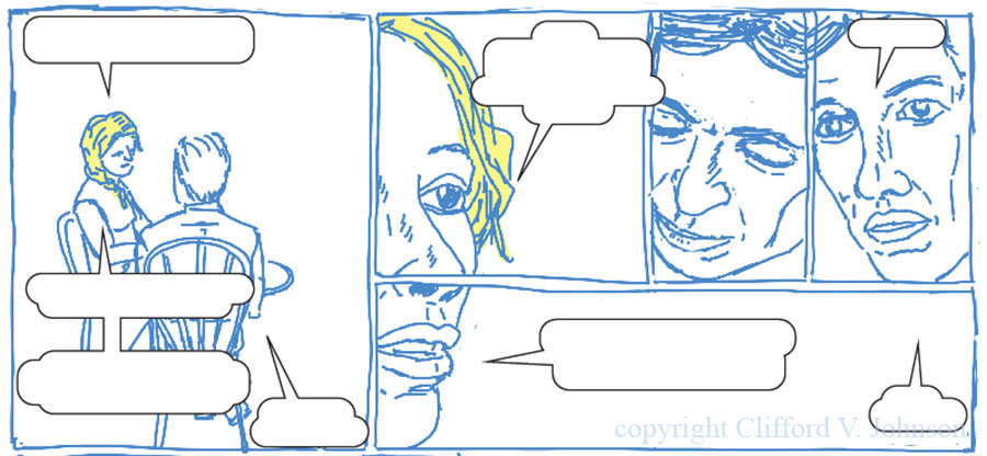
Rough layout design. Text suppressed because… spoilers. Feel free to supply your own dialogue… share it here if you like!
(Click image for larger view.)
In case you’re wondering, I’m trying here and there to find a bit of time to do a bit of rough (but less rough than last pass) layout design for the book. Sample above. This helps me check that all the flow, layout, pace, and transitions are correct with both text and images before I spend hours doing careful drawings and backgrounds and so forth only to discover it does not work. Here I’ve incorporated a slightly non-trivial flow. What order would you read the panels in? (Note to self: write a note to my publishers to discuss details of safe margins before doing any more detailed layout work…)
-cvj


Ha! A very kind take on it, I must say! Thanks!
-cvj
Roberto Ignacio Díaz liked this on Facebook.
For the first panel starting on the top left and going down
1. I hear Clifford has a new baby
2. Yes–isn’t that exciting.
3. However, somehow he’s still managing to blog, work on his book and garden.
4. Don’t you hate people like that.
🙂 Could resist
🙂
Alexander Protagonist liked this on Facebook.
Tony Foster liked this on Facebook.
Ok so I will give the second panel a try.
From upper left
1 So we now can show that Gravity is indeed entropic.
2 By the way we were out of coffee so that is half decaf
Top Right
3 Days off to a good start
4 Bekenstein bound and no caffeine.
Karen E Bender liked this on Facebook.
Alice Oven liked this on Facebook.
Clare Silk liked this on Facebook.
Mark Bernhardt liked this on Facebook.
Amy French liked this on Facebook.
Elliot, you are actually close, in a way, to the subject matter, if not the actual beats of this exchange…
Andrew John Nicholls liked this on Facebook.
Philip Shane liked this on Facebook.
Sarah Clayton liked this on Facebook.
Sophocles Steve Papavasilopoulos liked this on Facebook.
For the first panel starting on the top left and going down
1. I worked out this way that mass and information are equal.
2. I can use it to prove that Omega is extremely close to one.
3. If we assume the universe is fined tuned for our existence then we have a natural way to…..
Then on the lower right the other person speaks
4 Time out. I haven’t even had my first cup of coffee.
??
Layout Design http://t.co/gp6KmvoevE via @Asymptotia
This is like graphic novel mad libs!
Lynell George liked this on Facebook.