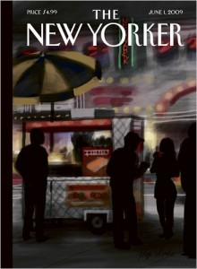
 The cover of the June 1st edition of the New Yorker (see right) was done by artist Jorge Columbo on an iPhone, using an application called Brushes. (Story here and here*.) This all smacks of (more) free iPhone advertising, on the surface, but there’s something impressive here.
The New Yorker’s website displays a video of the layering of paint brush strokes that he did, showing the process of constructing the art. I’m impressed. Not by the iPhone aspect of it so much as the painting technique and approach itself, especially in such a small space, and that he did it while standing there looking at the subject for the scene in question. It is fascinating to see his strokes. Have a look:
-cvj
*Thanks, Zdravka!


Oops! Sorry about that. Just goes to how important RTFA — or, in this case, watching TF Video — is before replying. 🙂
Now I’m really impressed!
Thanks… I’m sure it is excellent work (I will look later) but given what you say, in that case it is far from similar. This guy is just painting, not using digital photos as source material.
Cheers,
-cvj
Hello, Clifford.
There’s an artist on Flickr who does a somewhat similar work — in the sense that digital photographs are made to look like works on canvas.
A blog post about him: http://thomashawk.com/2008/11/new-artist-of-week-series-5-ron-dorio.html,
and his Flickr page: http://www.flickr.com/photos/av_producer/
Do love my IPhone. I know, I’m a snob :).