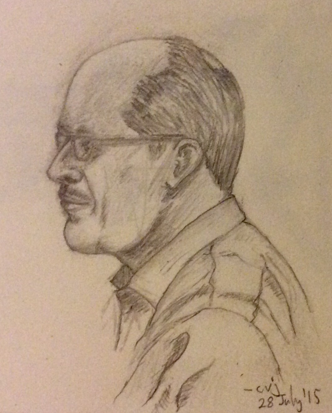
Parting Shot

Museo_historico_nacional_santiago_chile
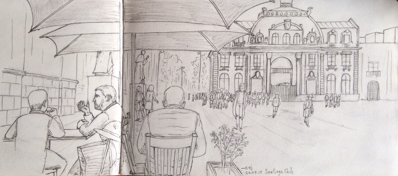
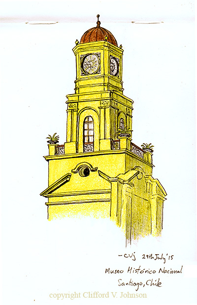
Wednesday was my last day in Santiago, and so after the morning Plenary talks I checked out of my hotel, stored my bag, and, boarding the subway, melted into the city for a few hours. I was not on the lookout for anything in particular, besides a sense (even a little) of the city’s life and flow. I also had in mind to spend a few hours at some galleries/museums (I’d already seen the Museum of Pre-Columbian Art (Museo Chileno de Arte Precolombino) on Monday night, and had a tour, as that’s where the conference reception was). I wanted to check out the Museum of Contemporary Art (Museo de Contemporaneo Artes) and Museum of Fine Arts (Museo de Bellas Artes), as well as the Museum of National History (Museo de Histórico Nacional), back in Plaza de Armaz, where I’d done that cafe and Post office sketch on Sunday. I also wanted to wander the streets and squares and just look at the people and buildings and goings on. And then I had to get back to the hotel at 6:45pm to grab my bag and jump into the taxi I’d ordered and head to the airport for my flight back to LA.

Well, I did pretty much all of those things, with no hiccups to speak of. I was a little annoyed that 95% of the Museum of Contemporary Art was taken up by a massive David LaChappelle retrospective – not because there isn’t something in his work one can find to like or at least be amused by (I had a good look around since I was there), but because it seemed ridiculous to have flown almost 1/3 the way around the planet to see an American artist’s work when what I wanted to see was work that was more local – but all turned out ok when in the Museum of Fine Art (the adjoining building in fact) I found a great deal of interesting contemporary (and other) art that was locally sourced. The buildings themselves were interesting to look at too, so that was a bonus.

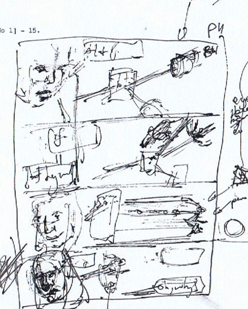
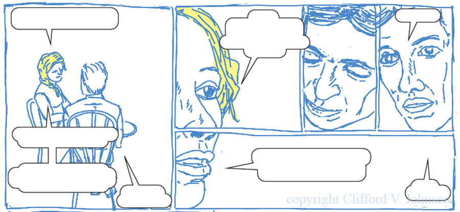
On a nearby street (Monjitas), I found a great spot for lunch and people-watching, and the woman who I took to be the proprietor of the cafe (who took my order) decided to engage me in conversation for while. Since she had little […] Click to continue reading this post

Almost Done

So Tuesday night, I decided that it was imperative that I paid a visit to one really good restaurant (at least) before leaving Santiago. My duties at ICMP2015 were over, and I was tired, so did not want to go too far, but I’d heard there were good ones in the area, so I asked the main organizer and he made a recommendation.

imageIt was an excellent choice. One odd thing: the hotel is in two separate towers, and I’d noticed this upon arrival and started calling it The Two Towers in my mind for the time was there. Obviously, right? Well, anyway, the restaurant is right around the corner from it plus a two minute walk, and…. Wait for it…it is called Le Due Tonni, which translates into The Two Towers, but apparently it has nothing to do with my observation about the hotel, since it got that name from a sister restaurant in a different part of town, I am told. So… An odd coincidence.

I will spare you the details of what I had for dinner save to say that if you get the fettuccini con salmon you’re on to a sure thing, and to warn that you don’t end up accidentally ordering a whole bottle of wine instead of a glass of it because you’re perhaps used to over-inflated wine prices in LA restaurants (caught it before it was opened and so saved myself having to polish off a whole bottle on my own)… Another amusing note is that one of my problems with getting my rusty Spanish out for use only occasionally is that I get logjams in my head because vocabulary from Spanish, French, and Italian all come to me mid sentence and I freeze sometimes. I’d just been getting past doing that by Tuesday, but then got very confused in the restaurant at one point until I realized my waiter was, oddly, speaking to me in Italian at times. I still am not sure why.

It was a good conference to come to, I think, because I connected […] Click to continue reading this post

Santiago

imageI’m in Santiago, Chile, for a short stay. My first thought, in a very similar thought process to the one I had over ten years ago in a similar context, is one of surprise as to how wonderfully far south of the equator I now am! Somehow, just like last time I was in chile (even further south in Valdivia), I only properly looked at the latitude on a map when I was most of the way here (due to being somewhat preoccupied with other things right up to leaving), and it is a bit of a jolt. You will perhaps be happy to know that I will refrain from digressions about the Coriolis force and bathtubs, hurricanes and typhoons, and the like.

I arrived too early to check into my hotel and so after leaving my bag there I went wandering for a while using the subway, finding a place to sit and have lunch and coffee while watching the world go by for a while. It happened to be at Plaza de Armaz. I sketched a piece of what I saw, and that’s what you see in the snap above. I think the main building I sketched is in fact the Central Post Office… And that is a bit of some statuary in front of the Metropolitan Cathedral to the left. I like that the main cathedral and post office are next to each other like that. And yes, […] Click to continue reading this post

Page Samples…!

second_set_samples_editThere’s something really satisfying about getting copies of printed pages back from the publisher. Makes it all seem a bit more real. This is a second batch of samples (first batch had some errors resulting from miscommunication, so don’t count), and already I think we are converging. The colours are closer to what I intended, although you can’t of course see that since the camera I used to take the snap, and the screen you are using, have made changes to them (I’ll spare you lots of mumblings about CMYK vs RGB and monitor profiles and various PDF formats and conventions and so forth) and this is all done with pages I redid to fit the new page sizes I talked about in the last post on the book project.

Our next step is to work on more paper choices, keeping in mind that this will adjust colours a bit again, and so forth – and we must also keep an eye on things like projected production costs and so forth. Some samples have been mailed to me and I shall get them next week. Looking forward to seeing them.

For those who care, the pages you can see have a mixture of digital colours (most of it in fact) and analogue colours (Derwent watercolour pencils, applied […] Click to continue reading this post

Marginal Activity

The last couple of weeks have seen me fiddling with another important task for the book: rethinking the page dimensions. This gets me into things like crop points, safe areas, bleeds, and so forth. It is sort of crucial that I worry about this now and not later because for the kind of book I am working on, every single page is a unique self contained entity that must be designed individually, while at the same time each page still depends on all the other pages to be just right. So a change in page dimensions is a huge deal in the process. This is not like writing large blocks of prose in the form of chapters and paragraphs, where the page dimensions are less crucial since your words will just flow and re-flow automatically to adjust to the new shape of container (the page), newly spilling over to the next page if need be. Instead, graphic elements -the drawings- all must work together on a number of different levels on the page, their relative positioning being crucial, and any text that is present must also respect that layout… In fact, text is really just another graphic element on the page, and is not as malleable as it is in a prose book.

sample_exp_iv (Random sample from a story I’ve just completed the roughs for in the new dimensions. You can see the red guide lines I work to to make sure that the page comes out fine at the printer, the inner being the “safe area” beyond which you don’t put any crucial elements like text in case they are cut off. The outer is the line where the page should end. Some of my pages have “bleeds” which means the art will flow all the way past that outer line so that when cropped that part of the page is covered entirely with art instead of it stopping due to a panel border…)

I say all this because it is an issue close to my heart right now. Back when I did all the art for the prototype story (some years ago now), and right up to last year, I did not yet have a publisher for the book, so therefore of course no idea what the final page dimensions might be. Different publishers have different favourites, print capabilities, and so forth. So I made the best decision […] Click to continue reading this post

Lost Treasure

very_rough_pageStill doing detailed layouts for the book. I’ve been working on a story for which I was sure that I’d done some rough layouts a long time ago that I really liked. But I could not find them at all, and resigned myself to having to do it again. There’s always that moment of hesitation where one is poised between just diving in and re-doing something, or spending more time searching… Which is the better strategy to save time? This time, I thought I’d do one last look, and started to dig around in my computer, hoping that maybe I’d had the sense to scan the sketches at some point – I vaguely recall having made a policy decision to scan developmental sketches whenever I could, for ease of […] Click to continue reading this post

So the equations are not…

Working on rough layouts of one of the stories for the book. One rough panel ended up not looking so rough, and after Monday’s ink dalliances I was itching to fiddle with brushes again, and then I thought I’d share. So… slightly less rough, shall we say? A more careful version would point the eyes a bit better, for example…(Much of the conversation, filling a bit more of the while space, has been suppressed – spoilers.)

light_relief_II_sample

-cvj Click to continue reading this post

Quick Experiment…

On my way back from commencement day on campus last Friday I got to spend a bit of time on the subway, and for the first time in a while I got to do a quick sketch. (I have missed the subway so much!) Yesterday, at home, I found myself with a couple of new brushes that I wanted to try out, and so I did a brushed ink sketch from the sketch… quick_ink_experimentIt felt good to flow the ink around – haven’t done that in a while either. Then I experimented with splashing a bit of digital colour underneath it. (This is all with the graphic book project in mind, where I think at least one story might […] Click to continue reading this post

Getty Visit

LAIH_luncheon_getty_2Every year the Los Angeles Institute for the Humanities has a luncheon at the Getty jointly with the Getty Research Institute and the LAIH fellows get to hang out with the Getty Scholars and people on the Getty Visiting Scholars program (Alexa Sekyra, the head of the program, was at the luncheon today, so I got to meet her). The talk is usually given by a curator of an exhibition or program that’s either current, or coming up. The first time I went, a few years ago, it was the Spring before the launch of the Pacific Standard Time region-wide celebration of 35 years of Southern California art and art movements (’45-’80) that broke away from letting New York and Western Europe call the tunes and began to define some of the distinctive voices of their own that are now so well known world wide… then we had a talk from a group of curators about the multi-museum collaboration to make that happen. One of the things I learned today from Andrew Perchuck, the Deputy Director of the Getty Research Institute who welcomed us all in a short address, was that there will be a new Pacific Standard Time event coming up in 2018, so stay tuned. This time it will have more of a focus on Latino and Latin American art. See here.

LAIH_luncheon_getty_1

Today we had Nancy Perloff tell us about the current exhibit (for which she is […] Click to continue reading this post

Framed Graphite

framed_graphiteIt took a while, but I got this task done. (Click for a slightly larger view.)Things take a lot longer these days, because…newborn. You’ll recall that I did a little drawing of the youngster very soon after his arrival in December. Well, it was decided a while back that it should be on display on a wall in the house rather than hide in my notebooks like my other sketches tend to do. This was a great honour, but presented me with difficulty. I have a rule to not take any pages out of my notebooks. You’ll think it is nuts, but you’ll find that this madness is shared by many people who keep notebooks/sketchbooks. Somehow the whole thing is a Thing, if you know what I mean. To tear a page out would be a distortion of the record…. it would spoil the archival aspect of the book. (Who am I kidding? I don’t think it likely that future historians will be poring over my notebooks… but I know that future Clifford will be, and it will be annoying to find a gap.) (It is sort of like deleting comments from a discussion on a blog post. I try not to do that without good reason, and I leave a trail to show that it was done if I must.)

Anyway, where was I? Ah. Pages. Well, I had to find a way of making a framed version of the drawing that kept the spirit and feel of the drawing intact while […] Click to continue reading this post

Layout Design

Rough layout design. Text suppressed because… spoilers. Feel free to supply your own dialogue… share it here if you like!

panel_desgin_10_march_2015

(Click image for larger view.) In case you’re wondering, I’m trying here and there to find a bit of time to do a bit of rough (but less rough than last pass) layout design for the book. Sample above. This helps me check that all the flow, layout, pace, and transitions are […] Click to continue reading this post

In Print…!

graphic_novel_event_postcard_picture_ofHere’s the postcard they made to advertise the event of tomorrow (Tuesday)*. I’m pleased with how the design worked out, and I’m extra pleased about one important thing. This is the first time that any of my graphical work for the book has been printed professionally in any form on paper, and I am pleased to see that the pdf that I output actually properly gives the colours I’ve been working with on screen. There’s always been this nagging background worry (especially after the struggles I had to do to get the right output from my home printers) that somehow it would all be terribly wrong… that the colours would […] Click to continue reading this post